CVS Health: Designing a New Shop Experience

Problem: A commissioned report suggested that numerous improvements could be made to the CVS mobile mWeb experience.
Audience: CVS customers who used the mobile website (instead of the mobile app).
My Role/Contributions: Visual Design, Prototyping, Research Analysis.
Tools & Technology: Sketch, InVision App, digital whiteboard, sketching, ideation sessions, card sorting.
Outcome: Successful weekly design improvements released, with increased efficiency, click-through numbers and positive feedback.
Duration: 4 months
Project Overview
I helped the CVS mWeb retail team, as a contractor, to reevaluate the mobile experience, based on the findings of a usability audit. The goal was to present carefully studied UI solutions, for the executive stakeholders, and then execute the new design.
Working with the CVS retail team was a great experience. I was part of a small team of fellow Senior Designers, and two hybrid UX Developers. I contributed by studying and creating smooth workflows, and was able to implement new designs quickly. I also picked up some great pointers from the Developers, along the way.
The initial round of UX assessment, was based on a study by the Baymard Institute. Baymard is an independent web research institute with a main focus on e-commerce usability and optimization. We furthered our study by performing a competitive analysis, as well a designing new UI components.

As reported by the Baymard Institute: Overall the mobile live site is average when compared to 50 of the top grossing US e-commerce sites. The major downfall of the site is the category navigation, due to poor category page design and a very narrow main navigation menu.

Phase 1: Baymard Study, Our Solutions
Improve category navigation


Category list hierarchy and “Shop All” to hamburger menu


Phase 2: Redefining the Shop Experience
As our small group tackled our list of UI improvements, we realized that we had a great opportunity to do a deep dive into the Shop experience, specifically concentrating on product pages. Baymard studied our digital experience and UI, but they did not talk to specific CVS customers. By scheduling sessions with the research lab, we could study a customer’s interaction with mobile mWeb, and see their joy and pain.
In order to inject some creativity into our process, we decided to do some quick brain-storming exercises. The activities were meant to break away from mechanical problems, and focus on CVS as being the overall “product”. These quick exercises were open, honest and proved to be successful, as our main rule was “There are no wrong answers”.

Card Sorting: Pain points
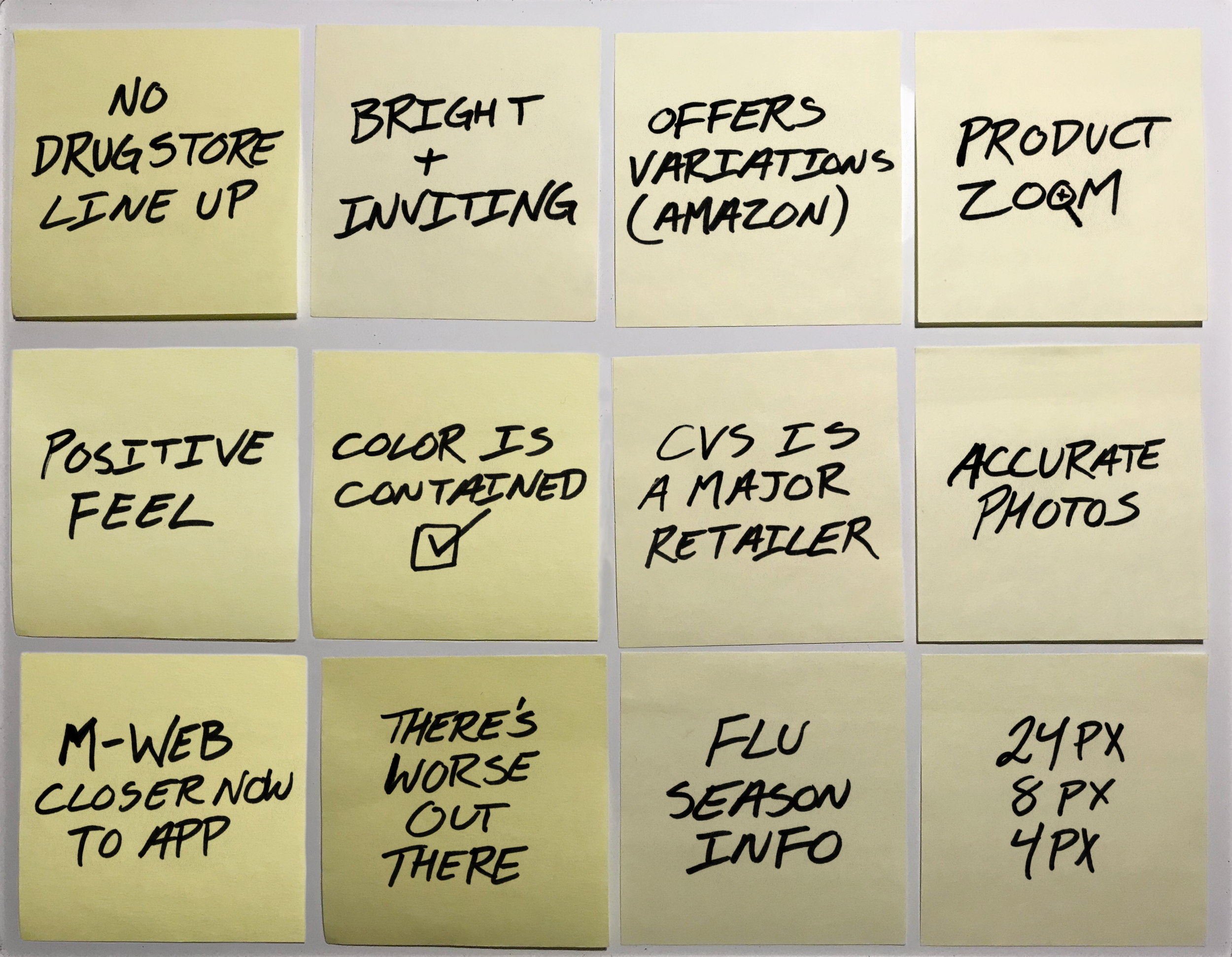
Card Sorting: Positive points
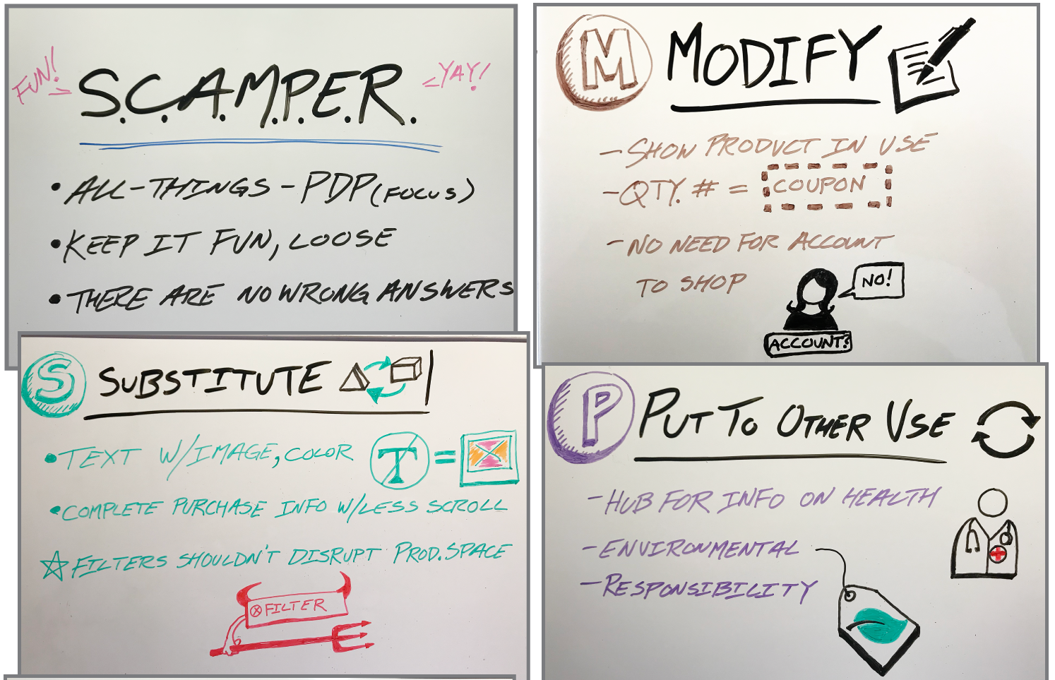
S.C.A.M.P.E.R. creative exercise

Crazy 8’s
Phase 3: CVS Labs Research & Results

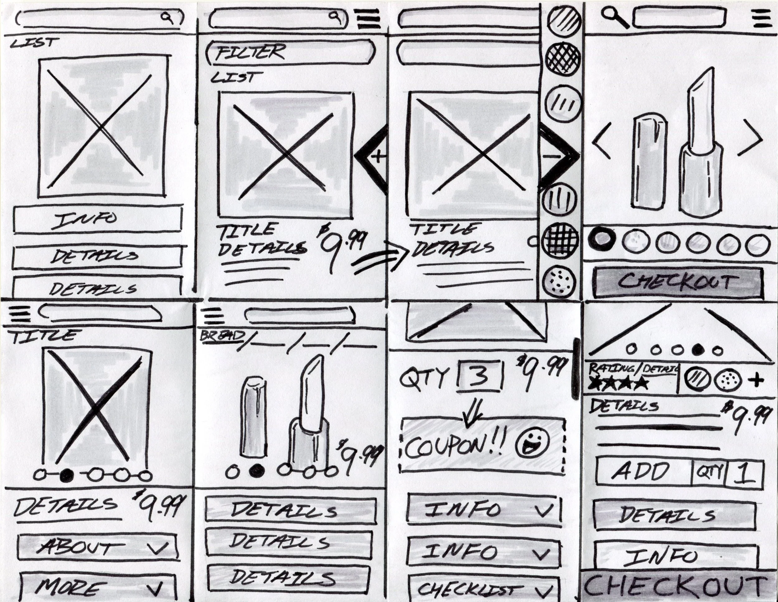
Use of a “Load More” button instead of pagination or endless scrolling

Product pages should have breadcrumbs, color variations should use swatches


Display all applied filters on the results page


Phase 4: Competitive analysis & pixel audit
Once UI changes were made, focus was then made on evaluating how users were making purchases, or stopping in the process, once inside the product pages. The first step, was a competitive analysis of five other leading online retailers, to see how product pages were displayed and used. This included an evaluation of the first 1500 pixels, which was really helpful in seeing how many pixels does it take, to provide a function.
First 1500 pixels of competitor’s mobile web product display pages

Self-audit of CVS product display pages (2700+ pixels…as long as a printed CVS receipt!)

Self-audit solutions

Additional studies and pixel audit of product list tiles
New “Add to Basket” design and UI specs

New “Add to Basket” prototype

RESULTS
I really enjoyed this project as I contributed a lot of insight and effort, while also learning a lot about retail backend processes.
Biggest score improvement was the “Page Layout” which was now a solid “Good”.
Scores improved to “Acceptable/Good” for Navigation and Search.
Overall engagement increased by 22%, which included the completion of new purchases.
Three years after completing this project, these implemented changes were still relevant in the mWeb design.
Six years after completing this project, the core aesthetics of a Product Page still exists!