TD Bank: Alerts & Customer Experience

Problem: The bank wanted to add Alerts to the mobile app, but needed assistance with designing the new program and discovering customer needs.
Audience: TD Bank Customers, business stakeholders.
My Role/Contributions: Product Designer, closely working with various stakeholders, UX Research and Development.
Tools & Technology: Figma, Photoshop, Illustrator.
Outcome: Successfully evaluated, designed, tested and delivered new product program and features, enhanced the customer experience through feedback from prototype testing.
Duration: 1 year project.
Project Overview
TD Bank (US) did not have a very robust mobile alerts system, for their customers. While it was great to discover this problem, the stakeholder approach was to “just use the mobile alerts that Bank of America have”. My role for this project included:
Working closely with UX Strategists, to 1). discover TD Bank customer needs, and 2). present specific findings to stakeholders, citing that TD Bank customers have specific needs, when compared to customers who belong to other banks.
Gather customer feedback, with UX Research, to discover a customer’s needs, likes, dislikes, etc. when using mobile banking.
Building mobile prototypes, and testing them with TD Bank customers. These findings would be presented to the stakeholders, which included storyboards and videos.
Delivering final developer-ready assets and instructions.
Working with UX Strategy
I was afforded the opportunity to work with the strategy side of user experience, which was new and very rewarding. My genuine empathetic approach to customers, as well as my flexible demeanor with stakeholders, allowed me to introduce some calm, within an environment that contained a lot of “resistance”. During this time, I took two courses from IDEO U, and applied my learning towards this project. The courses were “Designing Strategy” & “Activating Strategy”.


Collaborating with UX Research
In my experience with designing for financial products, I’ve worked with some very skilled UX Research labs. I have to say that the research team at TD Bank was one of the best, as I learned a lot about how to effectively build a project’s hypothesis.
Previously in my experience, a UX team would draft up a general outline of a project, submit their “order”, and let the researchers perform their magic. At TD, rather than inform the designers about the findings, the UX Research would include design, throughout the discovery process. For this Alerts program, we found that it was important to speak with stakeholders and designers, as a coexisting team.
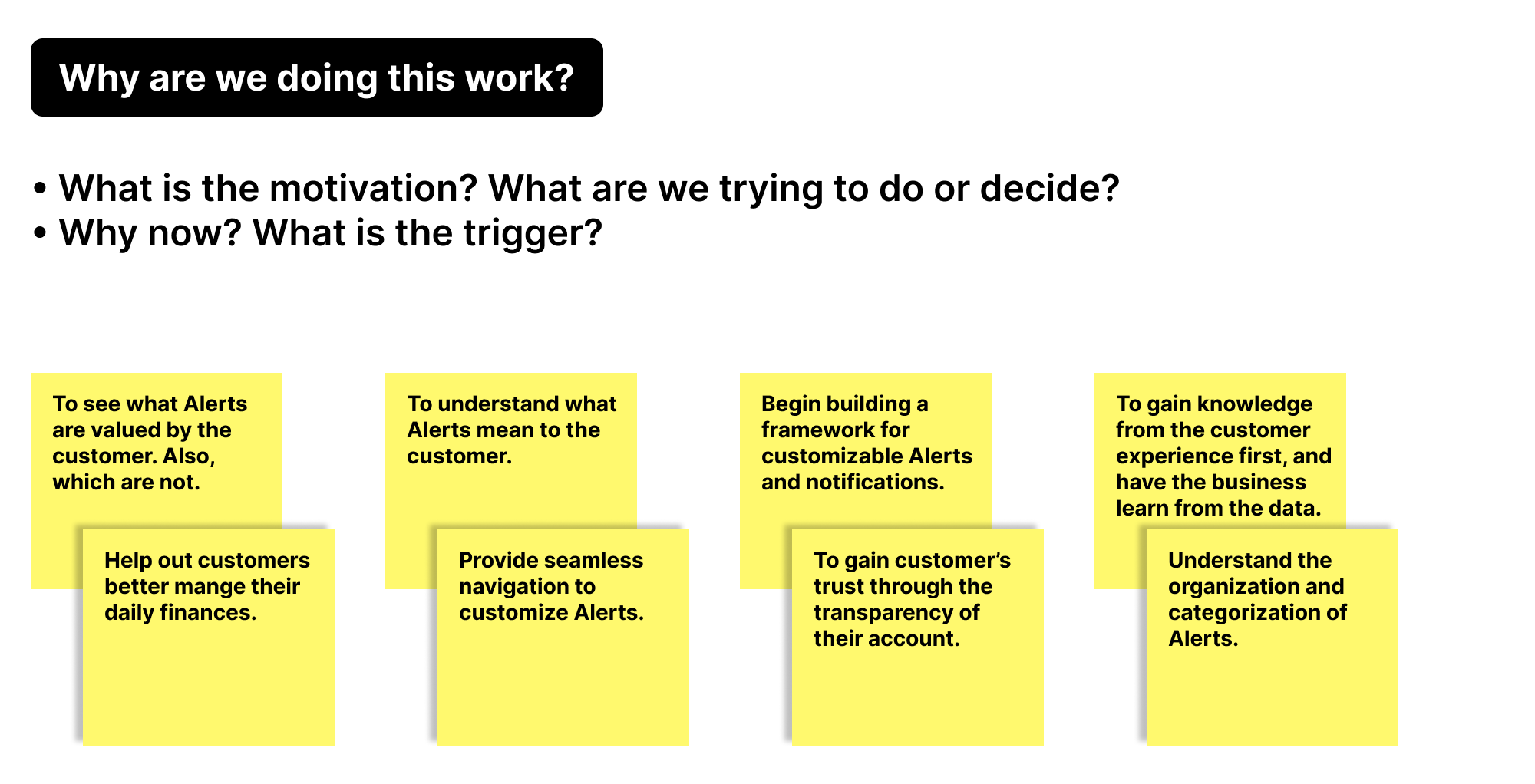
Below is the discovery phase of the Alerts program. My role role was to participate and gather findings from the ideation sessions, which would help our team target specific customer needs and requirements.


Inventory of current UI & executed solutions
Historically, customers had indicated that the TD app’s navigation was not clear, and features were hard to find. This was further confirmed by our Alerts customer interviews. The timing of this project worked in our favor, as our team earned a spot for “Alerts” as part of the main menu, and contributed additional UI modifications to the mobile app.
The top concerns by customers, in regards to the app’s UI and Alerts, were:
“Where are the Alerts located?”
“I shouldn’t have to dig for Alerts.”
“Can customizing Alerts be more prominent on the main page, rather than a Setting?”


Key takeaways from customer surveys & interviews
As expected, customer involvement and feedback was key to developing the Alerts program. Through grouping and card-sorting exercises, these were some of the top requests by TD Bank customers:
If the balance of my checking account is low, I would like to be notified.
If there is fraudulent activity on any of my accounts, I need to know immediately via text, email, phone call.
Sometimes, I need to know all of the charges to my account, and where the charge was made.
I want to set this Alerts feature easily and securely.


Illustrations for presentation
Through my IDEO U strategy courses, I learned more effective ways to present ideas and programs to stakeholders. For example, if a group of stakeholders within finance look all day long at charts and graphs, the last thing they need to see in a creative presentation are more graphs and charts. We found that using illustrated characters in a storyboard, or short videos, to be much consumable and better received. As an illustrator, I always welcome the opportunity to contribute my creativity to a presentation!


Deliverable prototype and final UI elements
At TD Bank, stakeholders expected all work to be presented in high fidelity, and Development requested many custom use cases. We found that rolling out a new feature’s function and flow, within a 6 screen path, to be the most effective. Below is an example of the most requested Alert; a customer’s personal bank accounts.


Launch & business impact
Post-launch, the customizable Alerts mobile feature was well received!
After the first 90 days:
Over 60% of current users created new Alerts settings, largely due to the new UI design.
Over 70% of new TD Bank (US) mobile app users set up Alerts, upon first launch.
Calls to Customer Service that were categorized as “Alert Inquiry” dropped by over 80% (once enrolled).
“Fraudulent Activity” became the second most requested Alert, following bank account balance.